fundação oriente
about
the project
Developed within the scope of EDIT’s User Experience and User Interface Design Course. The scope of this project was to redesign the website homepage, and develop a new feature.
My role was mainly focused on: desk research, building the persona, paper wireframing, designing the interface, pixel perfect alignment and prototyping.
Role
User Research
Interface Design
Prototyping
Team
Matilde Pacheco
Tânia Farinha

challenge
Redesign the “Fundação do Oriente” website homepage to correct user experience errors, and develop a new feature that responds to some of the user needs.
designing
the solution
01
who are our users?
The first research we made was about museum and culture consumers in Portugal: who are they? Why do they visit the museums? What do they look for in a museum and its website?
The data below are from the study “Estudo de Públicos de Museus Nacionais (EPMN)” promoted by Direção-Geral do Património Cultural (DGPC).
Age
The chart below presents portuguese museum visitors by age.
- 15 to 24 years 18%
- 25 to 34 years 19%
- 35 to 44 years 25%
- 45 to 54 years 17%
- 55 to 64 years 12%
- 65 or more 10%
A large part of Portuguese museum visitors are between 35 and 44 years old, with a strong tendency of those with university degrees and with a slight majority tendency for women.
Educational Level
The chart below presents portuguese museum visitors by Educational Level.
- Elementary and Middle School 7%
- High School 20%
- Post High School 4%
- University 68%
%
of visitors are women
%
of foreign visitors use the internet as a prior source of information to visit the museums
%
of portuguese visitors use the internet as a prior source of information to visit the museums
Motivation to visit the museum
In the chart below we find the different motivations that lead people to visit museums.
- Interest in the museum 89%
- Knowing or reviewing the permanent exhibition 68%
- Accompaning someone in a visit 44%
- Knowing or reviewing a temporary exhibition 41%
- Visiting the museum’s park / garden 31%
- Professional or study reasons 29%
- Attending cultural activities 15%
- Guided tour organized by the museum 14%
- Watching shows 14%
- Participating in specific activities for children, seniors or other groups 12%
The main reasons why people visit a museum are intrinsically linked to the museum itself – interest in the museum and permanent exhibition – the reasons for returning have to do with new things – new exhibitions.
Reasons to return to a museum
The chart below shows the reasons why people return to a certain museum.
- New exhibitions 65%
- Reviewing or completing today’s visit 38%
- Museums at Night 27%
- Music concerts 25%
- International Museum Day / Museum Night 22%
- Other shows (theater, dance / performance, cinema) 20%
- Conferences, colloquia, courses 17%
- Activities for children 12%
- Other 7%
02
Fundação Oriente website
In this project we worked on an already existing website, therefore we did a study of the same website, in order to identify some of the navigation problems and make the necessary changes when redesigning it.

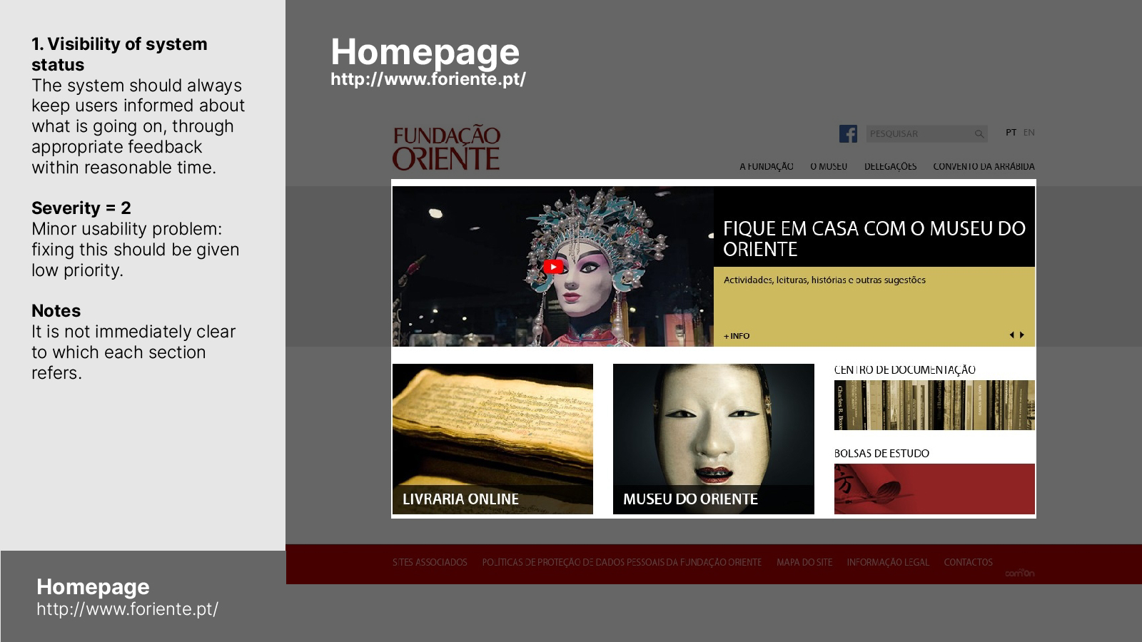
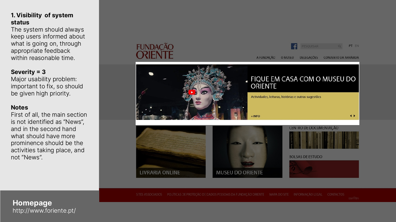
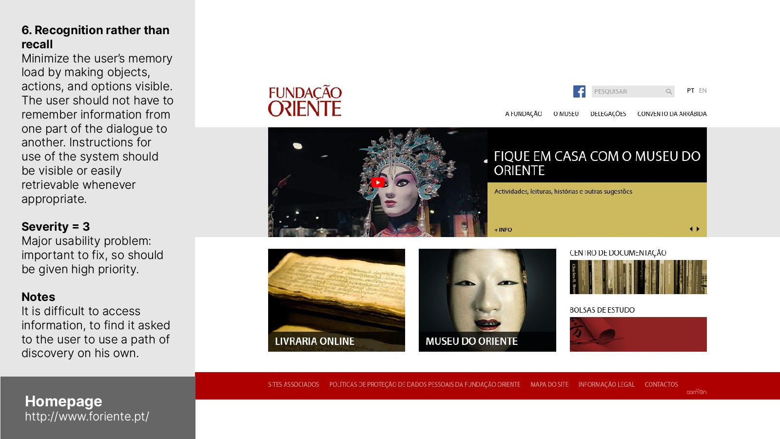
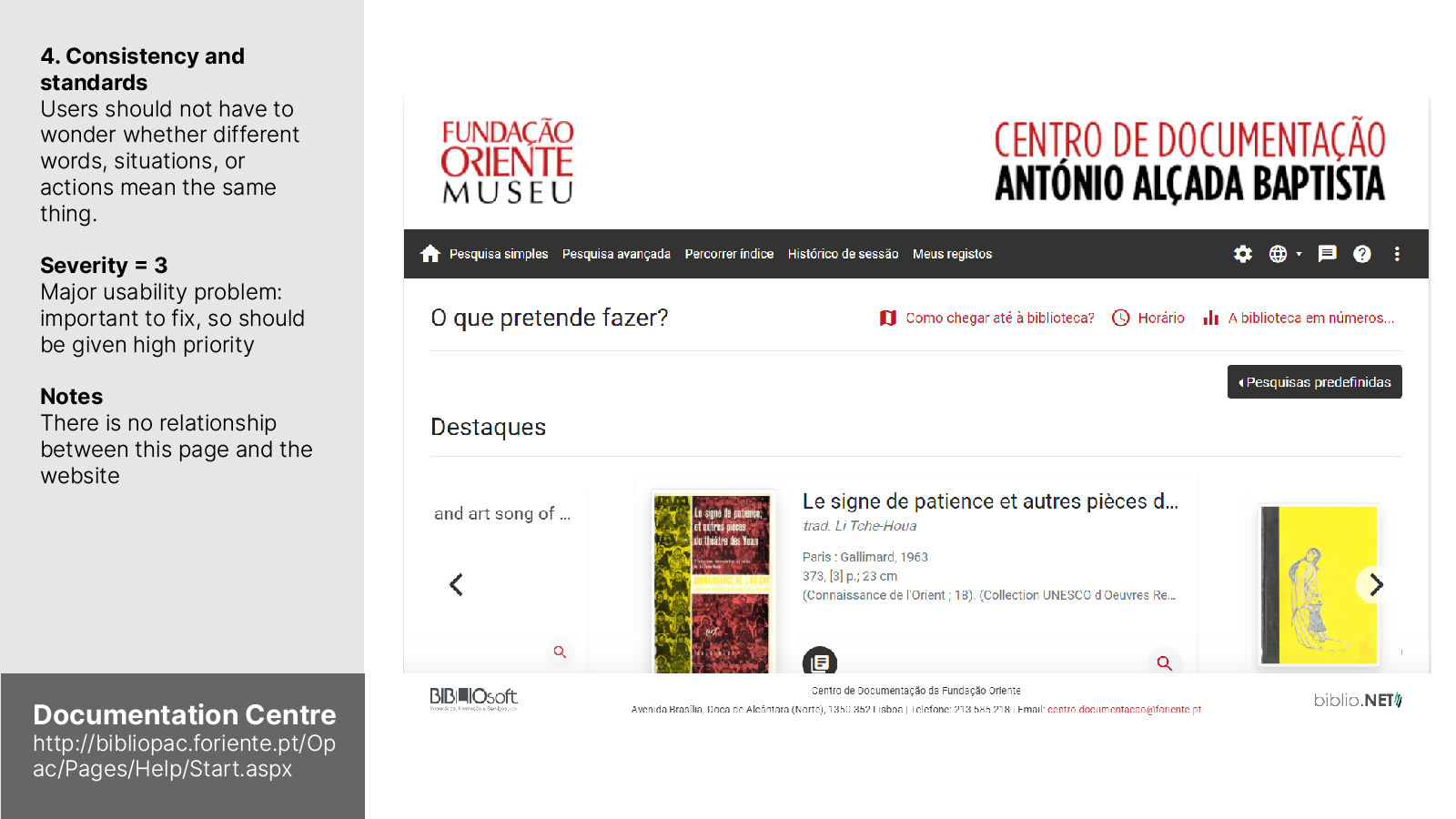
heuristic evaluation
We made a heuristic evaluation centered on the pages that were relevant to our challenge: the homepage and the books section.
In the image gallery on the side you can find some of the critical points found.
site map
Fundação Oriente is a very complex Institution, with many services and delegations, and the website appears to be quite confusing, so we made a site map at the moment we started the project, to understand how we could improve the information architecture.

03
persona
Based on the demographic data of the most frequent users of museums in Portugal, we built our persona.
In addition to the aforementioned and previously presented research, we crossed other data in order to be able to build a more solid persona, such as within the professional area and respective income.

Dora
“A Investigadora”
38 years old. Female. University-educated. University Researcher in the field of Linguistics. Single. Lives alone. Has a cat.
Dora has a lot of intellectual and cultural curiosity. She is perfectionist, ambitious, autonomous, very organized, rational and selective. She cherishes friendships in restricted groups and her program choices are always the most calm ones.
She enjoys travelling, reading, cinema and making cultural visits.
The challenges she imposed on herself are to save money to travel and win a scholarship to be able to do a PhD.
Her life objectives are to acquire more intellectual and cultural knowledge, therefore she devotes a lot of time to study. She wants to move up in her career so she can win the Prémio Pessoa, a recognition prize.
“In saving you will find the gain. Be clever, be organized, there’s no time or money to waste in life”
dora’s tech habits
She finds a lot of information online
She is a medium mobile user, but an heavy internet user.
Top sites/apps she visits:

04
mapping user needs, offers and opportunities
At this point, it seemed relevant to map the museum offerings, the needs and frustrations of our persona, define the problem statement and then identify which points should be further explored, resolved and worked on, as well as opportunities that could arise.
05
problem statement
After our research we discovered some of the habits, motivations and frustrations, and pointed out the problem our persona faces.

06
redesigning the website
To solve the problem we redesigned the information hierarchy, developing a new site map and ensuring that the information was easily found and the user would not get lost.
Within the scope of the exercise, the pages we actually redesigned were the homepage and the books page.
The website has a bad hierarchy of information making it too difficult to access


wireframes lo fi
For the design of our app we started with paper wireframing. It is the best and most effective way to start, because it provides a way to sketch the interface and test it with less effort wasting.
wireframes hi-fi
After the lo-fi wireframes, we moved on to the hi-fi wireframes, to refine the design. These wireframes were already very close to the final design, but the menu was afterwards totally reworked.

visual design and final layouts
For the development of our graphic line, we focused on the interiors of the museum and the exhibitions as well as on oriental characteristics, having naturally a connection between the two “worlds” mentioned.
In addition to colour (red, black and white), we looked for other visual points of chinese and oriental culture: architecture, alphabet characters and chinese ink.
The architectural lines crossing vertical and horizontal straight lines, such as beams and columns, create an idea of “misaligned geometry” but at the same time very strong and balanced.
The same lines are found not only in the architecture but also in the characters of the Chinese alphabet and for this reason, it became the central idea for the graphic structure.

desktop website
In the desktop version, due to the screen space that we don’t have on mobile, we tried to recreate this idea of the museum spaces, alternating between white and red, and with a part loaded with black, mainly on the menu, creating the immersive environment found in the inside of the exhibitions. We used a lot of “misaligned geometry” present in the architecture in which we were inspired and built the menu following that line.
Taking into account our problem statement and the urgency of organization, we gathered all the information on the site in a single and intuitive menu and created a very important feature – the possibility of buying books online.
mobile website
In the mobile version, we have maintained the menu structure as in the desktop version, with the “misaligned geometry” present in the architecture and in the chinese alphabet.
Although there is a difficulty inherent in the size of the screen, we tried to transport that same language using the lines as a visual concept troughout the mobile website.
In our heuristic evaluation we have discovered some problems, such as the main section in the homepage, so we have created a hero section (in both desktop and mobile) with the information that should actually be there: the current events taking place in the museum. Another point that came out from our heuristic evaluation was the “dated font”, so we have chosen one – Big John Pro – that evoques the solid body of the chinese characters and its sharpened corners.